This book brings together the thinking behind SIRR and the elements that make it recognisable. Use it to guide the words, images, objects and experiences through which the brand meets the world.
CHAPTER 01
The brand
What is seen. What is felt.
01.1 / NAME & MEANING
A secret, held in the detail.
SIRRسِرّArabic · “secret”
SIRR is a contemporary women’s ready-to-wear brand founded by Maya Jouni, built around deceptive simplicity.
Its name offers a way to express the quiet depth of the clothes: a detail discovered through wearing, a poem kept close, a garment that holds more than first meets the eye.
Proposed name narrative
The connection between the name and these details is editorial interpretation for approval.
01.2 / PURPOSE & POSITIONING
Intention, made effortless.
To dress women who carry a lot with the intention and ease they deserve.
The purpose
Make dressing well feel considered and effortless, through pieces that work together and carry meaning in their details.
The offering
Curated, seasonless separates with a personal shopper’s eye. A buildable wardrobe supported by clear styling direction.
The woman
She moves between responsibilities, occasions and cities. She values precision, versatility and the confidence of feeling like herself.
01.3 / THE FOUNDER
Through Maya’s eye.
Maya Jouni brings a personal shopping background and training in business and fashion design to the brand. Her perspective begins with how women live, then considers how clothes can support them.
Born in Berlin. Made in Dubai. The brand’s world holds both European and Arabic influences, expressed through considered dressing, poetry and personal detail.
01 / FOUNDER PORTRAIT
Approved portrait of Maya Jouni
Replace with final photography
01.4 / PERSONALITY & VOICE
Calm authority. Genuine feeling.
Warm
Speak to a woman, personally and respectfully. Recognise the life she is dressing for.
Precise
Give useful detail. Explain how a piece fits, moves or works with the wardrobe.
Poetic
Leave room for feeling. Use imagery sparingly, with meaning behind every phrase.
PROPOSED CAPTION
A little structure. A little room to move.
PROPOSED DESIGNER’S NOTE
Wear the blazer open over a fine knit. Add the matching trouser for a considered silhouette, or soften it with denim.
Illustrative styling copy; adapt to the actual garment.
Avoid empty luxury claims, corporate distance, motivational clichés and language that tries too hard to impress.
CHAPTER 02
The identity
A family of marks. One quiet presence.
02.1 / THE WORDMARK
The name takes the lead.
Supplied identity reference · Replace with approved vector artwork
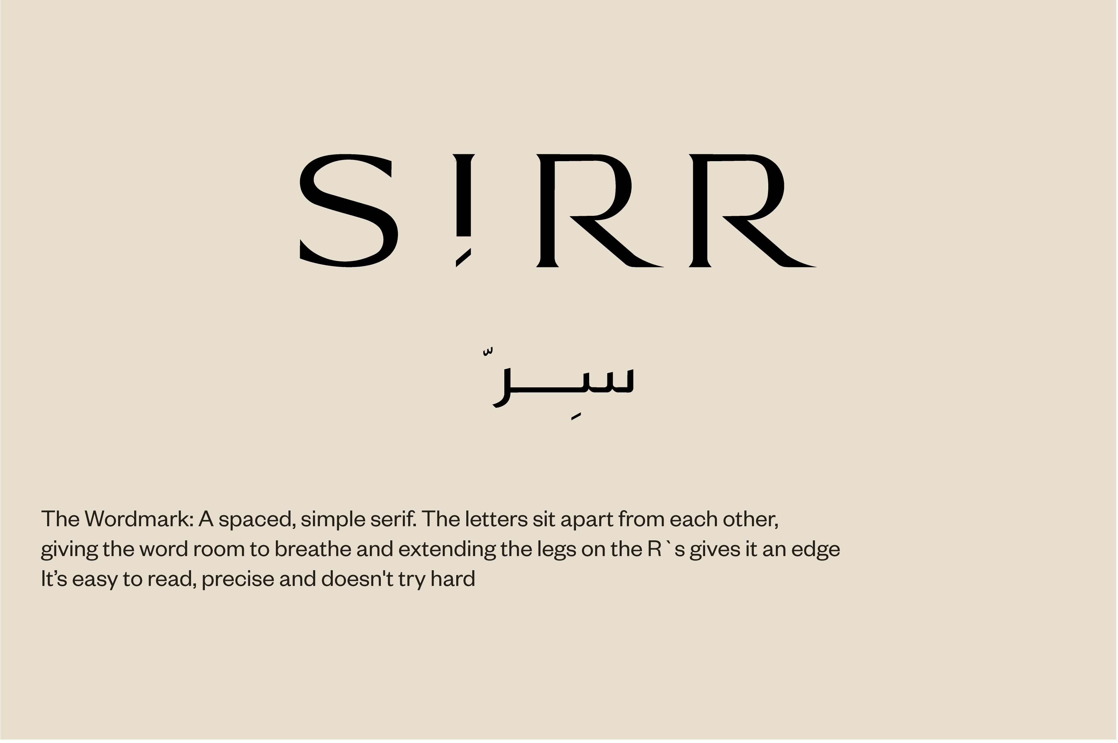
Primary wordmark
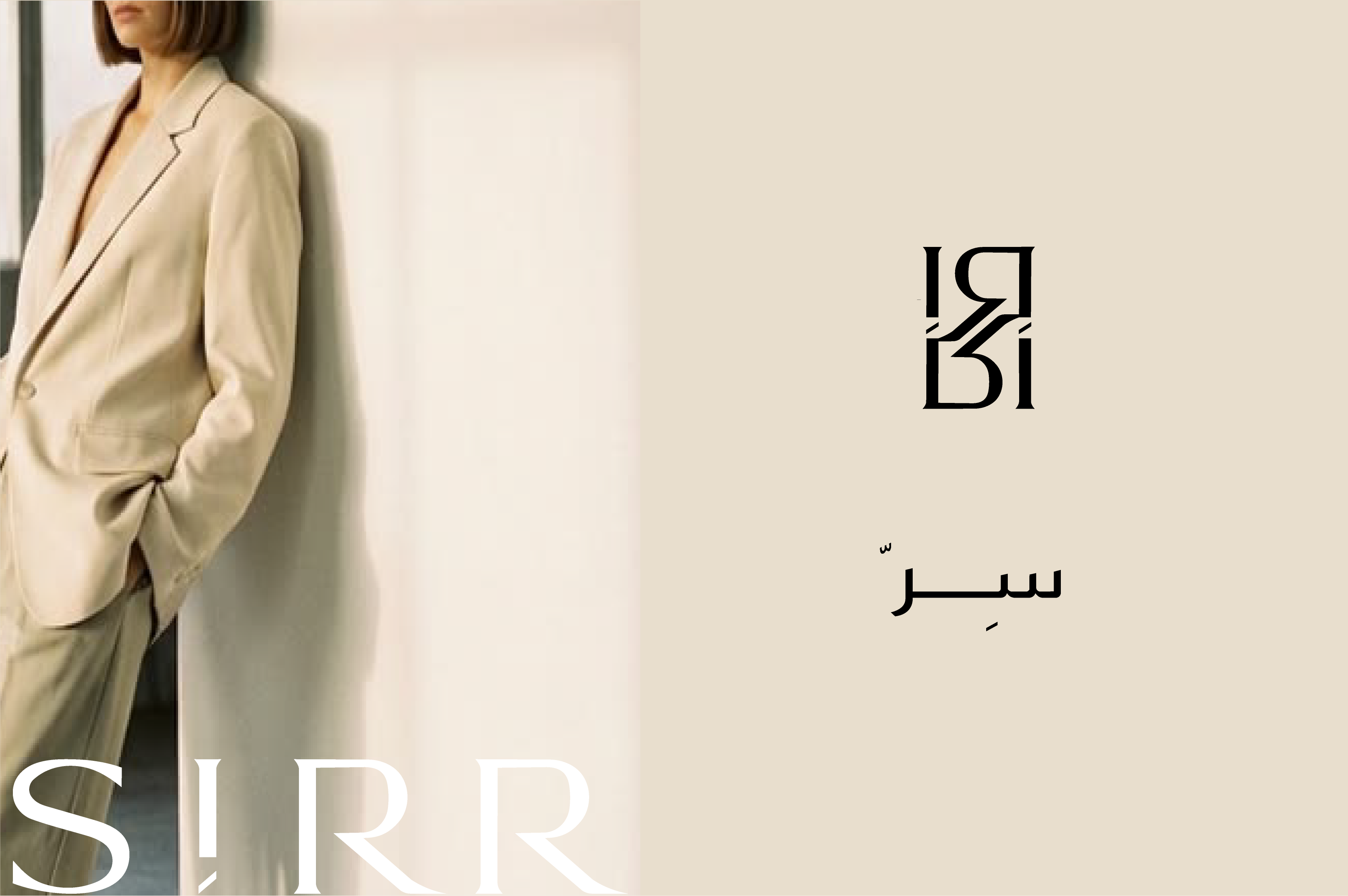
The Latin wordmark introduces the brand. Preserve its exact letterforms, proportions and spacing; it must be placed as artwork, never recreated by typing.
Arabic wordmark
Use the approved Arabic artwork with its original diacritics. Select the Latin, Arabic or paired version for the audience and available space.
Final lockups [Add approved arrangements]Clear space [Add measured exclusion zone]Minimum size [Confirm print & screen sizes]
02.2 / THE MONOGRAM
A detail that rewards a second look.
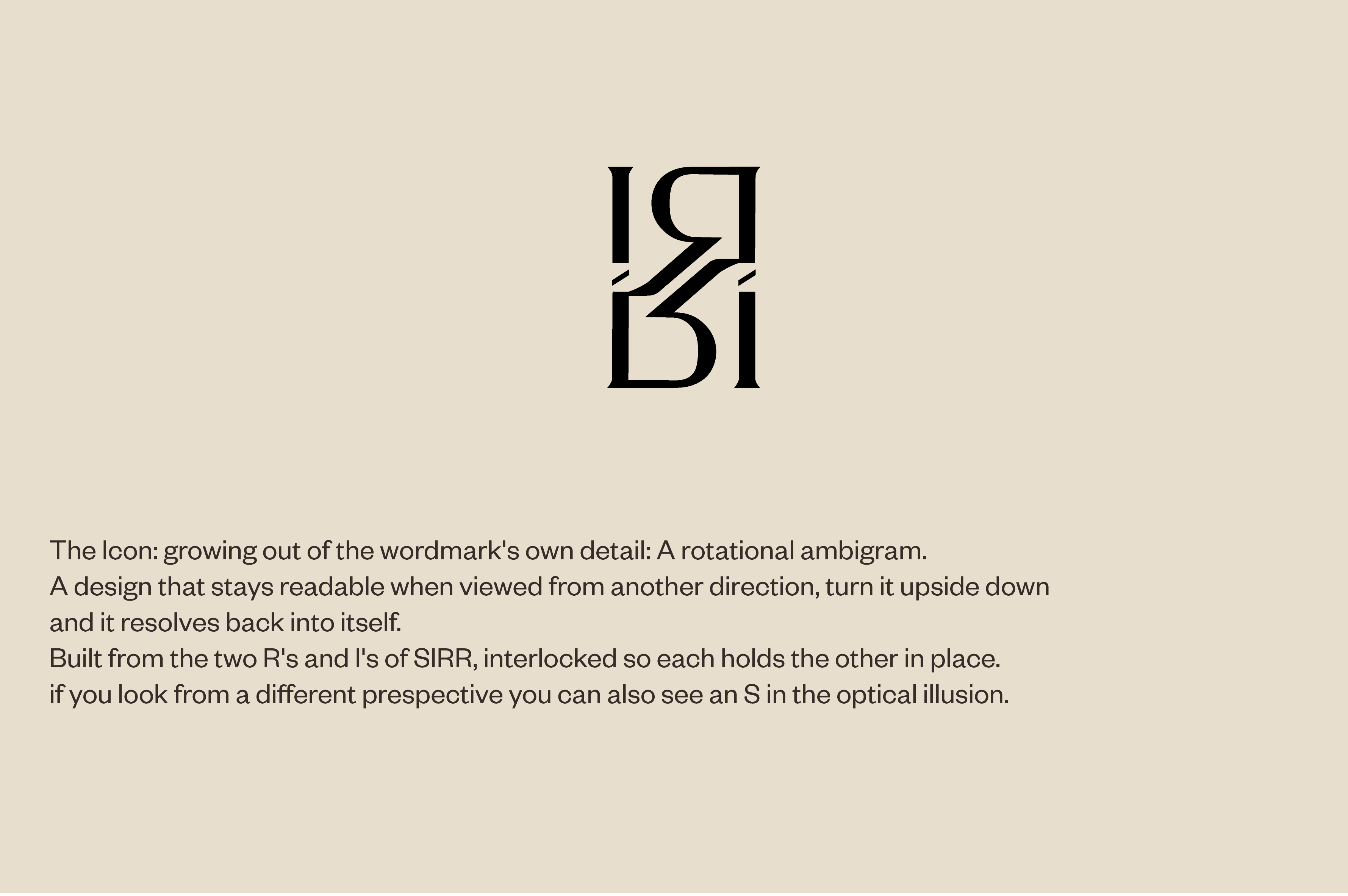
Supplied monogram reference
The interlocking form grows from the wordmark’s own letterforms.
The supplied concept describes a rotational ambigram built from the two Rs and Ss, with a hidden S revealed through its construction.
Proposed role
A compact signature for small touchpoints and tactile applications, where the full wordmark would feel crowded. Introduce the brand name elsewhere when recognition cannot be assumed.
Use the approved orientation and artwork. Do not reconstruct, separate or alter the interlocking elements.
02.3 / THE JASMINE
The softer signature.
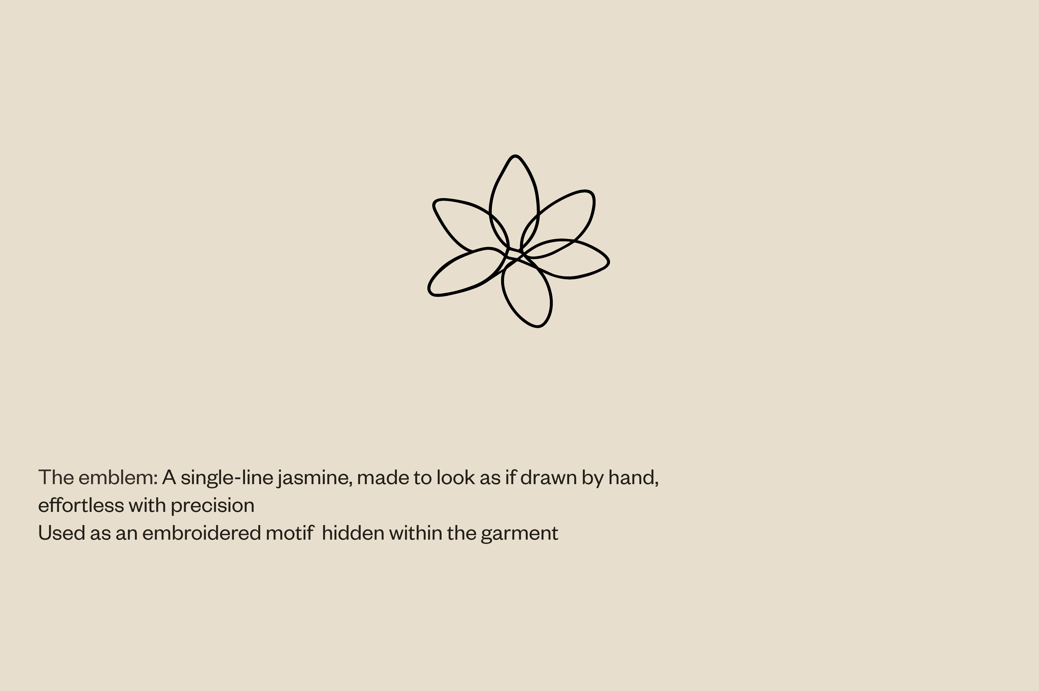
An imperfect, hand-drawn jasmine brings a human touch to the identity.
The supplied direction pairs an effortless line with precise execution and proposes embroidery as a detail hidden within the garment.
Proposed role
Use as a secondary detail on garments, cards or selected packaging. Give it space and keep the linework delicate.
Embroidery and debossing may require a tested production version. Keep any simplified artwork separate from the master emblem.
Supplied emblem reference
02.4 / USING THE MARKS
Consistency is in the restraint.
Preserve
Use supplied artwork at its original proportions. Keep the marks distinct and follow approved lockups.
Protect
Leave the confirmed clear space free of type, imagery and trim edges. Choose a background with adequate contrast.
Resist
Do not stretch, outline, add digital shadows, change letter spacing or place the mark over a busy image.
02 / LOGO USAGE SHEET
Clear-space diagram · minimum sizes · correct and incorrect examples
Insert approved measured artwork for each mark
General guidance above is proposed. Exact limits remain open until approved artwork and production tests are available.
02.5 / COLOUR
Warmth. Depth. A little light.
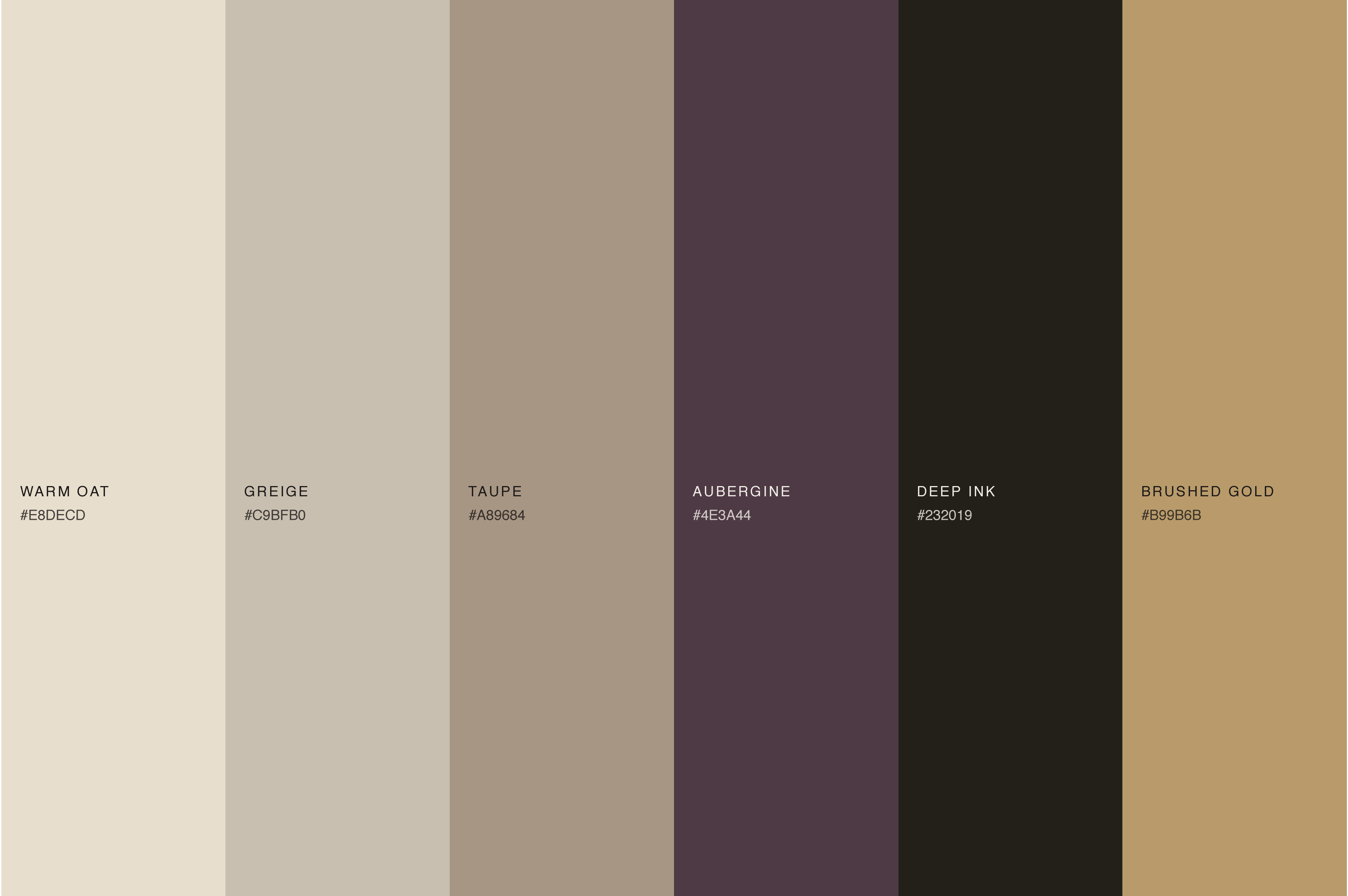
Supplied palette reference · Confirm specifications from original design files
The foundation
Warm oat, greige and taupe establish the neutral world of the brand.
The depth
Aubergine and deep ink give typography and selected surfaces greater presence.
The accent
Brushed gold introduces a restrained highlight. A digital colour is not a specification for metallic foil.
Colour roles are proposed. This page uses approximate reference-inspired colours, not production colour standards.
02.5A / COLOUR PAIRING
One palette. Considered combinations.
Choose one foundation and one contrasting colour. Give each a clear role: a surface, a wordmark or a small accent.
Proposed combinations using the HEX values in the supplied palette. These specimens retain those reference colours when you change the book’s page colours. The typeset SIRR is a placement example; use the approved logo artwork in final applications.
SIRRQuietly dressed. Deeply felt.
Warm oat + deep ink
Background #E8DECD · Lettering #232019
The everyday signature. Our starting choice for the website, brand book and printed cards. Warm oat carries the surface; deep ink carries the logo and information.
SIRRQuietly dressed. Deeply felt.
Aubergine + warm oat
Background #4E3A44 · Lettering #E8DECD
A richer expression. Use aubergine for covers, chapter openings and selected packaging. Warm oat creates a clear, restrained signature.
SIRRQuietly dressed. Deeply felt.
Deep ink + brushed gold
Background #232019 · Lettering #B99B6B
A considered accent. Use gold sparingly on dark packaging or special print pieces. This flat colour previews the pairing; metallic foil needs a physical proof.
SIRRQuietly dressed. Deeply felt.
Greige + deep ink
Background #C9BFB0 · Lettering #232019
A softer foundation. A quiet combination for stationery, labels and supporting layouts. Deep ink keeps useful information easy to distinguish.
SIRRQuietly dressed. Deeply felt.
Taupe + deep ink
Background #A89684 · Lettering #232019
Material warmth. A grounded pairing for packaging studies and tactile details. Keep the darker colour for lettering and the lighter colour for the surface.
SIRRQuietly dressed. Deeply felt.
Warm oat + aubergine
Background #E8DECD · Lettering #4E3A44
A warmer voice. An alternative to deep ink for poetry cards, editorial headlines and personal notes. Keep the surrounding layout simple.
Keep tonal pairings away from small text.
Warm oat, greige and taupe can sit together as materials or large colour fields. Their subtle differences make them poor starting choices for small lettering on one another. Brushed gold on warm oat is better reserved for a decorative finish than essential information.
For text, start with a light neutral against deep ink or aubergine. Check the final size and surface; printed stock, embroidery and metallic finishes behave differently from the screen.
02.6 / TYPOGRAPHY
A literary voice. A clear everyday language.
Typeface direction from the supplied reference
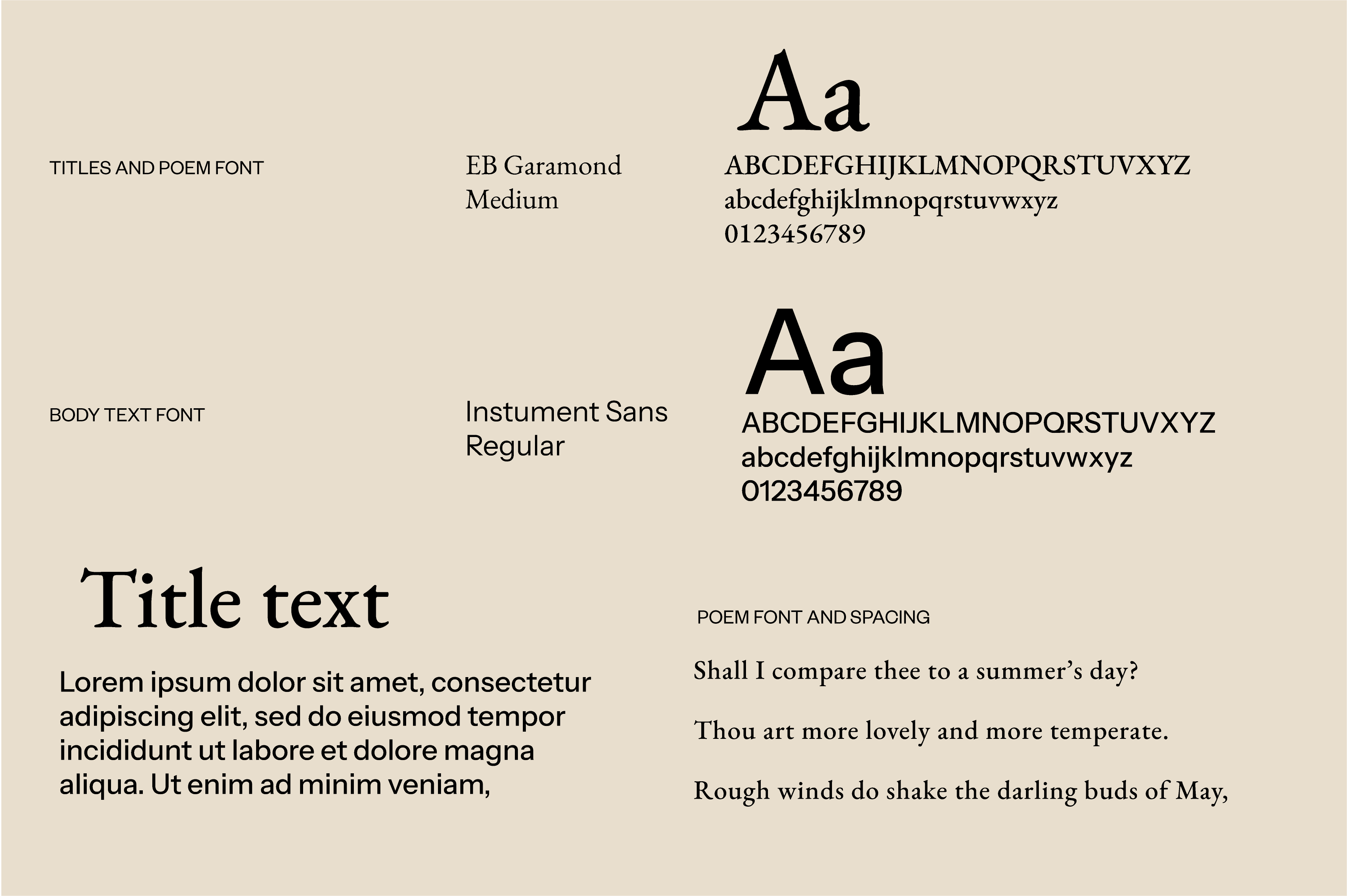
EB Garamond Medium
Titles and poetry. Let the serif carry feeling through scale and generous space.
Instrument Sans Regular
Body copy and useful information. Keep product details and styling advice clear and readable.
Arabic typography
[Add approved Arabic family, weights and pairing.] Arabic body text must remain readable and retain correct shaping.
Proposed hierarchy: expressive serif title → short sans-serif introduction → readable body → discreet caption. Confirm exact sizes and spacing for each format.
This HTML template uses available system serif and sans-serif fonts as fallbacks. The brand fonts above remain the intended reference.
CHAPTER 03
The expression
How the identity becomes a feeling.
03.1 / PHOTOGRAPHY
Clothes, lived in.
Supplied visual reference · Photography permissions and final selection to be confirmed
Campaign
Proposed: natural gestures, calm environments and styling that feels believable. The woman should feel present, rather than posed as an object.
Product
Proposed: consistent lighting and backgrounds, accurate colour, clear silhouettes and views that help someone understand the garment.
Detail
Proposed: close views of fabric, construction and hidden elements. Let texture and craftsmanship carry the image.
Avoid heavy colour grading, distracting props and retouching that misrepresents fabric or fit.
03.2 / COMPOSITION & LANGUAGE
Space gives the detail its voice.
Composition
Proposed: use generous margins, clear alignment and one dominant element per composition. Keep supporting copy short. Let images and quiet passages alternate.
English & Arabic
Use the appropriate reading direction for each language. Balance visual weight rather than forcing equal character sizes. Preserve Arabic shaping and diacritics; never add Latin-style letter spacing.
03 / BILINGUAL COMPOSITION
Approved Arabic poem English translation
Add poet credit, translation credit and usage permission
Poetry should feel selected, personal and relevant. Credit the poet and translator and confirm permission before production.
03.3 / MATERIALS & FINISHES
Quiet, made tangible.
Paper & cord
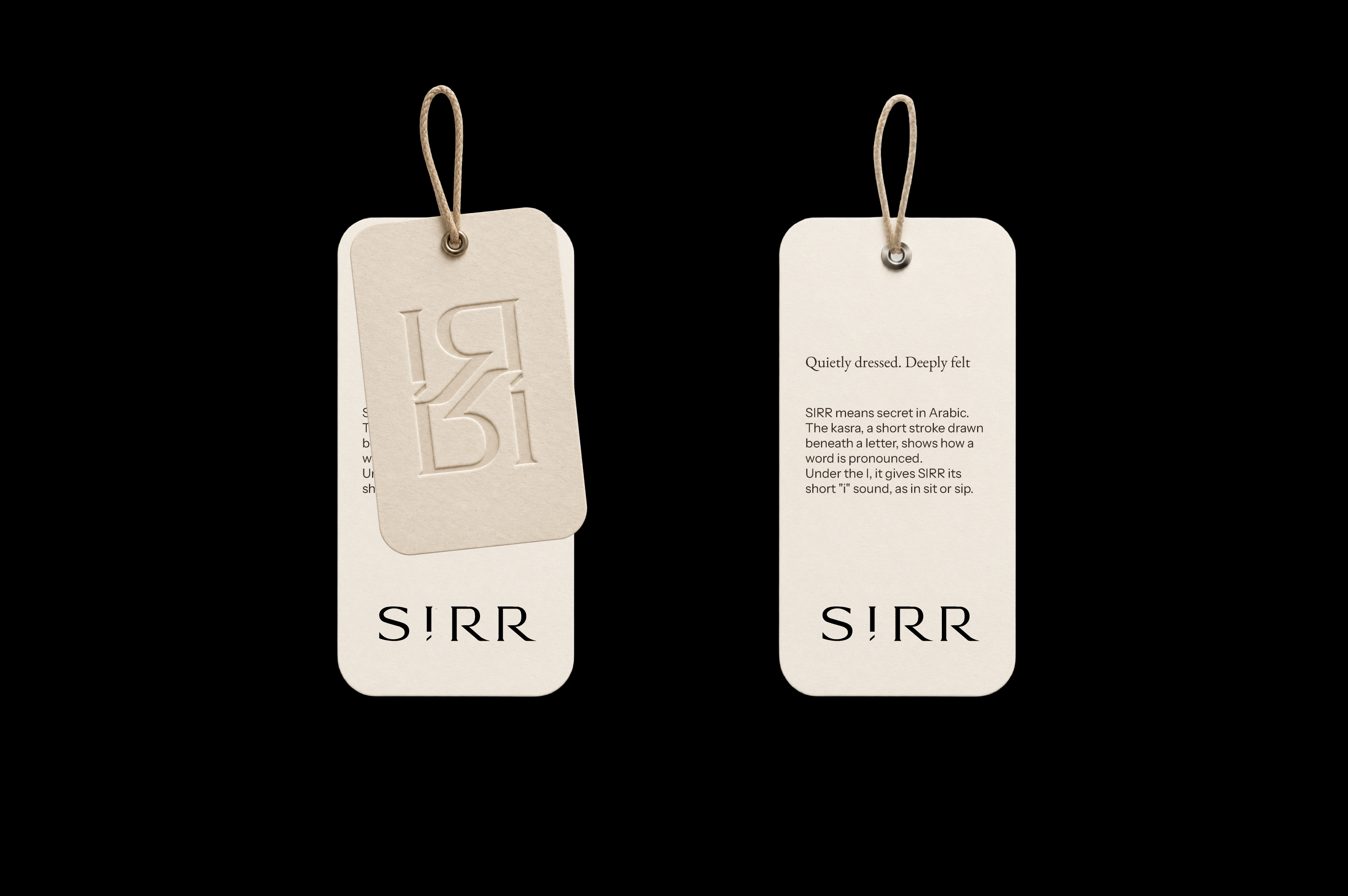
The supplied hang-tag reference suggests warm, tactile paper and a fine natural cord. Confirm paper weight, shade, thickness and cord construction with samples.
Blind debossing
Let light reveal the impression. Confirm die detail, impression depth and paper suitability through a physical proof.
Embroidery
Maintain the character of the line. Confirm thread colour, stitch construction, backing and minimum scale on the actual garment fabric.
Brand foundations and founder background are adapted from “Brand Strategy Workbook — Maya Jouni (final)”, supplied by the client. The brand name was confirmed as SIRR in the project discussion. Identity visuals are the seven supplied Artboard PNG references. New voice examples, name narrative and application guidance are proposed for review.